 My recent blog posts have really emphasized the importance of office ergonomics on employee productivity and health. But the design of our workplace isn’t just about the products that help us get work done, but how our surroundings effect how we feel. And as individuals living in a time where we no longer have to leave our seat to communicate with someone miles away, we spend a majority of our lives indoors. Usually by the 9th hour of the workday, some of these spaces can seem smaller than managable. But within the confinements of an office certain elements can determine the mood of an employee. A number of studies related to this idea have shown the possible effects of color combinations on worker well being.
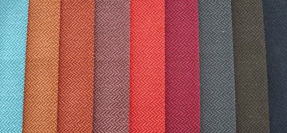
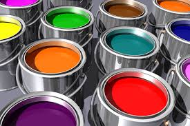
The power of color is not an unfamiliar concept. And in the business world, companies put a lot of time into choosing them for logos, signage, uniforms, etc. with the thought that these colors will relay a certain message about their company. The same concept applies to how employees and customers feel based off of the colors in a company’s office. As you begin deciding what objectives you hope to relay through the color of your office or cubicle, you should know the mood each of these colors convey. Here’s how the following colors are said to influence your personal attitude and the impressions of others.
White: Complete and pure. This color means perfection and new beginnings like a blank canvas or an unwritten story. It is completely reflective and open, which is great for refreshing your thoughts or offering inner calm, but too much white can encourage detachment, isolation, and emptiness.
Red: Symbolic for taking action, being passionate, or feeling angry. It is associated with energy and power and painting a room red will encourage cortical arousal. Not necessarily a good choice if you have high blood pressure.
Blue: A calming influence that can lower heart rate and respiration, probably because it suggests trust, loyalty, and peace. It has a need for order and direction, which makes it good for workspaces. It is also inflexible and hesitant or resistant of change, so it may not be for you if your goal is flexibility.
Yellow: A memorable color representing the mind and intellect, which explains the idea behind the post-it note. It’s good to surround yourself with yellow in order to concentrate or be creative, but too much yellow can provide some anxiety or impatience.
Black: Associated with strength and confidence. It signifies keeping things bottled up and creating an air of mystery. A black suit makes you feel powerful, but a black room sets up a barrier to the outside world. If you’re going for an inviting look, black is not your color.
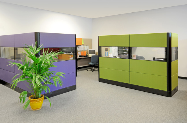
Green: Symbolizes balance, renewal, and growth, but is also soothing and calm. It combines the mental clarity of yellow with the emotional stability of blue, providing a strong sense of good judgment. On the flip side, however, it can relay greed or materialism.
Purple: The color of imagination. It can be creative and versatile. Some also say it can help with headaches if these are common in your workday. But this color relates to fantasy and an escape from practicality, which would benefit more creative professions.
Orange: Endorses communication and optimism. It’s uplifting and encourages a gut instinct unlike the physical reaction of red. It is also known for simulating appetite, so it is great for restaurants or kitchens, but not ideal for your office if you’re trying to lose weight.
Pink: A relaxing, compassionate color that could help with anxiety and hostility, but can also be immature and silly. When we think of its combinations of red and white, it brings together the power and passion of one with the softened purity of the latter.